まずは以下のリンク先のページの説明を見る。 グラフを作成する上での色付けに関して、わかりやすくまとまっている。
統計グラフの色 - 奥村 晴彦
 https://okumuralab.org/~okumura/stat/colors.html
色の指定
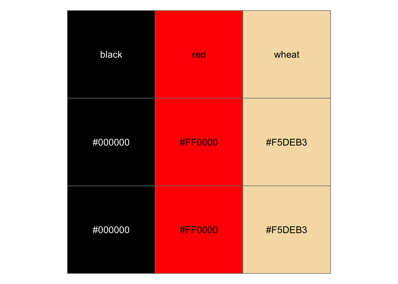
色名での指定と16進数カラーコードで指定する方法がある。 色の確認にはscales::show_col()が手軽で便利。 また、色を操作する関数が系統的に定義されている便利なパッケージとしてprismaticがおすすめ。
library(magrittr)
library(ggplot2)

# 色の指定方法
c(
  "black",   "red",     "wheat",   # 色名での指定
  "#000000", "#FF0000", "#F5DEB3", # 16進数カラーコードでの指定
  rgb(0, 0, 0),                    # あるいは色を指定する関数も使える
  hcl(12.17440, 179.04898, 53.24079),
  hsv(0.1085859, 0.2693878, 0.9607843)
) %>%
  # scales::show_col()に色を指定する文字列ベクトルを渡すと簡単に確認できる。
  scales::show_col(borders = "grey50")
Rに事前に定義されている色の名前はcolors()で確認できる。
colors() %>% head(12) # 定義されている色の名前(の一部)
##  [1] "white"         "aliceblue"     "antiquewhite"  "antiquewhite1"
##  [5] "antiquewhite2" "antiquewhite3" "antiquewhite4" "aquamarine"
##  [9] "aquamarine1"   "aquamarine2"   "aquamarine3"   "aquamarine4"
colors(distinct = TRUE) %>% length() # 定義されている色の数
## [1] 502
カラーパレット
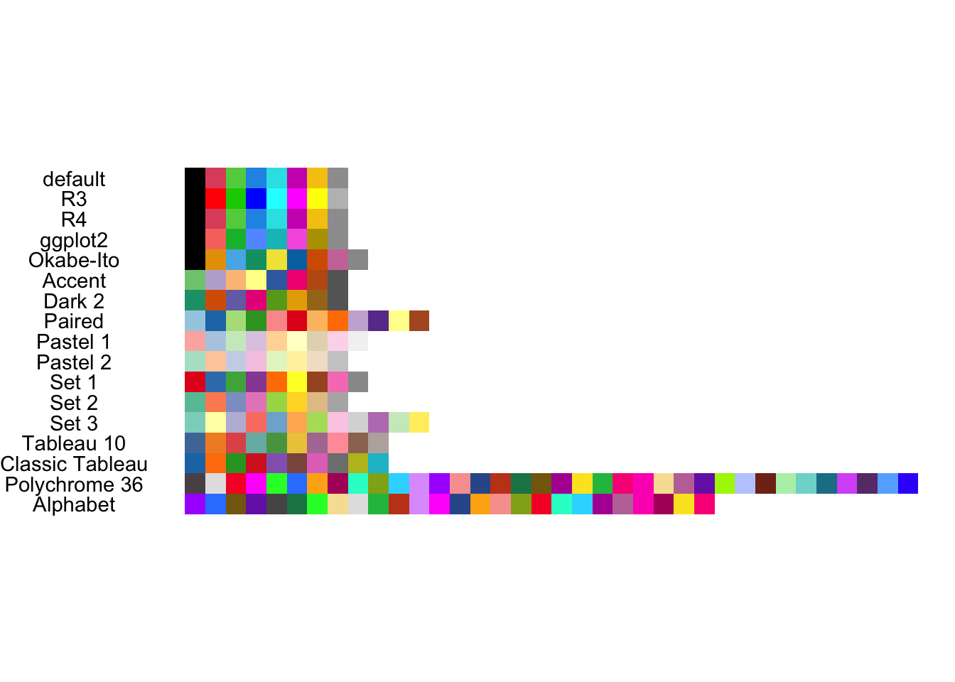
個別に色を指定するよりは、あらかじめ定義された色の集合(カラーパレット)を使う方が便利なことが多い。 Rでは多くのカラーパレットがすでに定義されており、自由に使うことができる。
# 事前に定義されたカラーパレットの名前
palette.pals()
## [1] "R3" "R4" "ggplot2" "Okabe-Ito"
## [5] "Accent" "Dark 2" "Paired" "Pastel 1"
## [9] "Pastel 2" "Set 1" "Set 2" "Set 3"
## [13] "Tableau 10" "Classic Tableau" "Polychrome 36" "Alphabet"
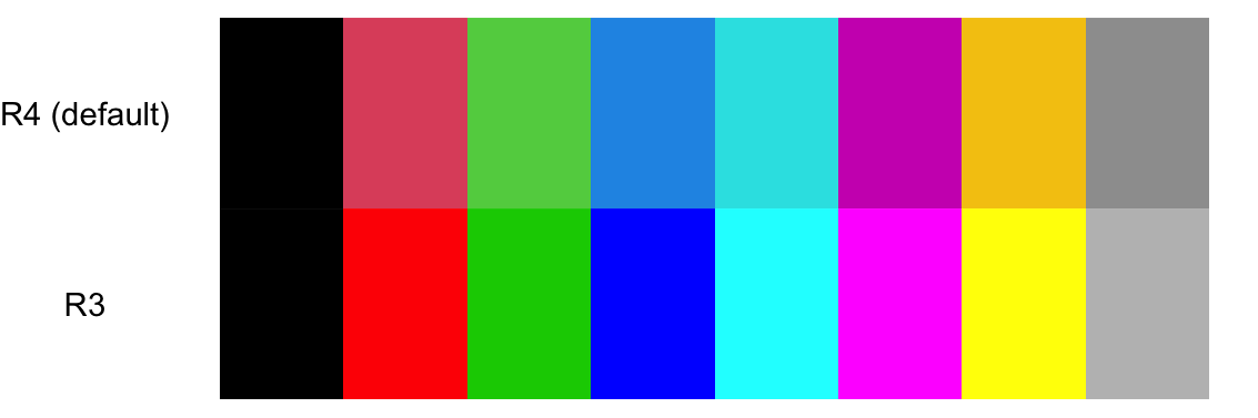
# デフォルトのカラーパレット
(col_default <- palette())
## [1] "black" "#DF536B" "#61D04F" "#2297E6" "#28E2E5" "#CD0BBC" "#F5C710"
## [8] "gray62"
# デフォルトのカラーパレットを変更
palette("R3")
palette()
## [1] "black" "red" "green3" "blue" "cyan" "magenta" "yellow"
## [8] "gray"
Code
# デフォルトのカラーパレットと比較
data.frame(
  x = c(1:8, 1:8),
  y = rep(c("R4 (default)", "R3"), each = 8),
  col = c(col_default, palette())
  ) %>%
  ggplot(aes(x, y)) +
  geom_tile(aes(fill = I(col))) +
  theme_void() +
  theme(axis.text.y = element_text(color = "black"))
grDevices::palette()で定義されているカラーパレットを全て可視化してみると以下のようになる。
Code
c("default", palette.pals()) %>%
  purrr::map(~ tibble::tibble(pal = .x, col = {palette(.x); palette()})) %>%
  purrr::map(dplyr::mutate, x = dplyr::row_number()) %>%
  dplyr::bind_rows() %>%
  dplyr::mutate(pal = forcats::fct_inorder(pal) %>% forcats::fct_rev()) %>%
  ggplot(aes(x, pal)) +
  geom_tile(aes(fill = I(col))) +
  coord_equal() +
  theme_void() +
  theme(axis.text.y = element_text(color = "black"))
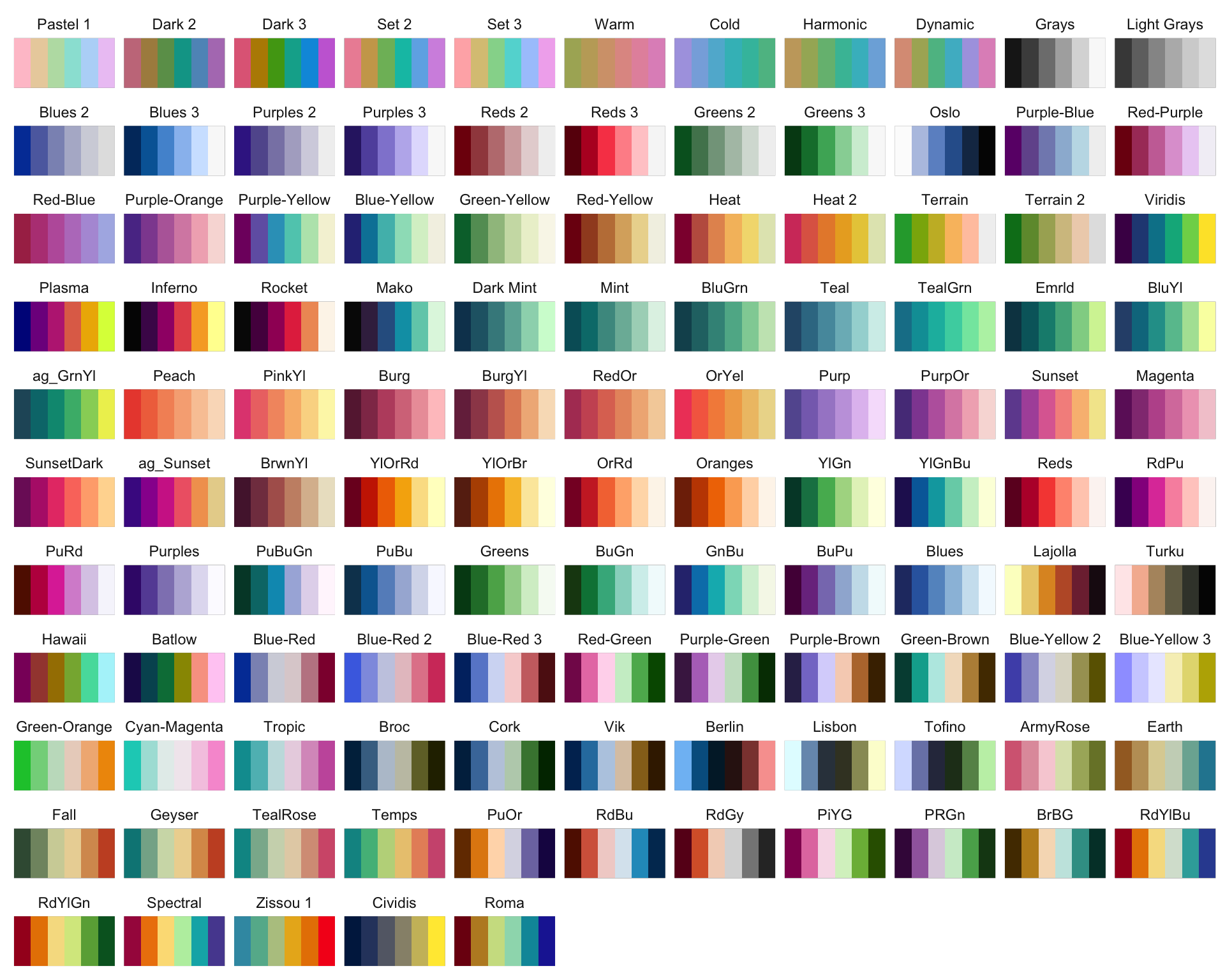
grDevices::palette()でみてきたのは離散変数を色分けする際に使えるカラーパレットだった。 実際のデータを色分けする際には、以下のように色分けする変数の特性にあったカラーパレットを選ぶ必要がある。
- Qualitative (定性的): カテゴリーデータ。特にカテゴリ間の順序がない場合。
- Sequential (順次的): 順序付けされた、あるいは数値的なデータ。
- Diverging (発散的): ある値を中心とするような数値データ。
grDevices::hcl.colors()を用いると、これら3つのデータそれぞれに適したカラーパレットを grDevices::hcl.pals()で確認できるカラーパレット名で指定することで利用できる。 以下にgrDevices::hcl.colors()で利用できるカラーパレットの見本を示す。
Code
# パネルの文字だけ残すtheme
theme_only_panel_text <- function() {
  list(
    coord_cartesian(expand = FALSE),
    theme(
      title = element_blank(),
      axis.text = element_blank(),
      axis.ticks = element_blank(),
      rect = element_blank(),
      panel.grid = element_blank()
    )
  )
}

hcl.pals() %>%
  setNames(nm = .) %>%
  purrr::map(~ tibble::tibble(col = hcl.colors(6, .x))) %>%
  purrr::imap(~ dplyr::mutate(.x, pal_name = .y, x = dplyr::row_number())) %>%
  dplyr::bind_rows() %>%
  dplyr::mutate(pal_name = forcats::fct_inorder(pal_name)) %>%
  ggplot(aes(x, 1)) +
  geom_tile(aes(fill = I(col))) +
  facet_wrap(~ pal_name) +
  theme_only_panel_text() +
  theme(panel.background = element_rect(color = "grey50", linewidth = 1))
色覚多様性を意識した色を使う
色の見え方は人によって異なる可能性がある。 プロットを作成する際には、 自分と異なる色覚の人にとっても見分けがつきやすいような色を選ぶとよいだろう。
色覚多様性については以下に示す連載に非常に詳しく記述されているので、 是非一読することをおすすめする。
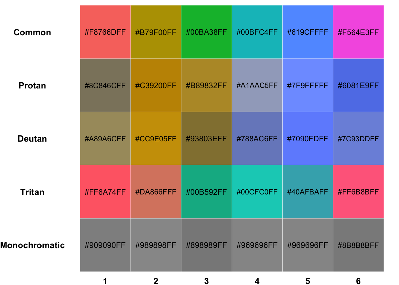
下のグラフでは、離散型データの色分けする際にggplot2でデフォルトで選択される色が、 異なる3つの二色覚を持つ場合に判別のしやすさがどう変化するのかを、 prismaticパッケージを用いて、一般型(Common, C型)の色覚者向けにシミュレートしている。 見てみると、C型では一番上のように見えるのに対し、Protan (P型)、Deutan (D型)、Tritan (T型)の二色覚では判別しにくい色があるのがわかる(例:D型色覚の4-6など)。 また、ggplot2でデフォルトで選択される色は、 明度 (luminance) と彩度 (chroma) を固定して(一定になるようにして)、 色相 (hue) を変化させることで選択しているため、 モノクロにすると、最下段のようにほとんど色の判別が出来なくなってしまう。
Code
plot_color <- function(tbl) {
  tbl %>%
    tidyr::pivot_longer(dplyr::everything()) %>%
    dplyr::with_groups(name, dplyr::mutate, n = dplyr::row_number()) %>%
    dplyr::mutate(
      name = forcats::fct_inorder(name) %>% forcats::fct_rev(),
      lab_col =
        ifelse(prismatic::clr_extract_luminance(value) > 50, "black", "white")
    ) %>%
    ggplot(aes(n, name)) +
    geom_tile(aes(fill = I(value)), color = "white") +
    ggfittext::geom_fit_text(aes(label = value, color = I(lab_col))) +
    theme_void() +
    scale_x_continuous(breaks = 1:6) +
    theme(axis.text = element_text(face = "bold"))
}

color_default <- scales::hue_pal()(6)
tibble::tibble(Common = prismatic::color(color_default)) %>%
  dplyr::mutate(
    Protan = prismatic::clr_protan(Common),
    Deutan = prismatic::clr_deutan(Common),
    Tritan = prismatic::clr_tritan(Common),
    Monochromatic = prismatic::clr_greyscale(Common)
  ) %>%
  plot_color()
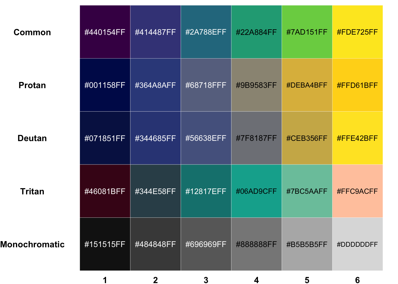
viridisはモノクロや色覚多様性を持つ場合でも、なるべく見やすく、かつ均等な色を提供するためのパッケージである。 いくつかのカラーパレットが含まれているが、代表的なviridisパレットで上図と同様の色覚多様のシミュレーションを行うと下のようになる。
Code
tibble::tibble(
  Common = scales::viridis_pal()(6) %>% prismatic::color()
) %>%
  dplyr::mutate(
    Protan = prismatic::clr_protan(Common),
    Deutan = prismatic::clr_deutan(Common),
    Tritan = prismatic::clr_tritan(Common),
    Monochromatic = prismatic::clr_greyscale(Common)
  ) %>%
  plot_color()
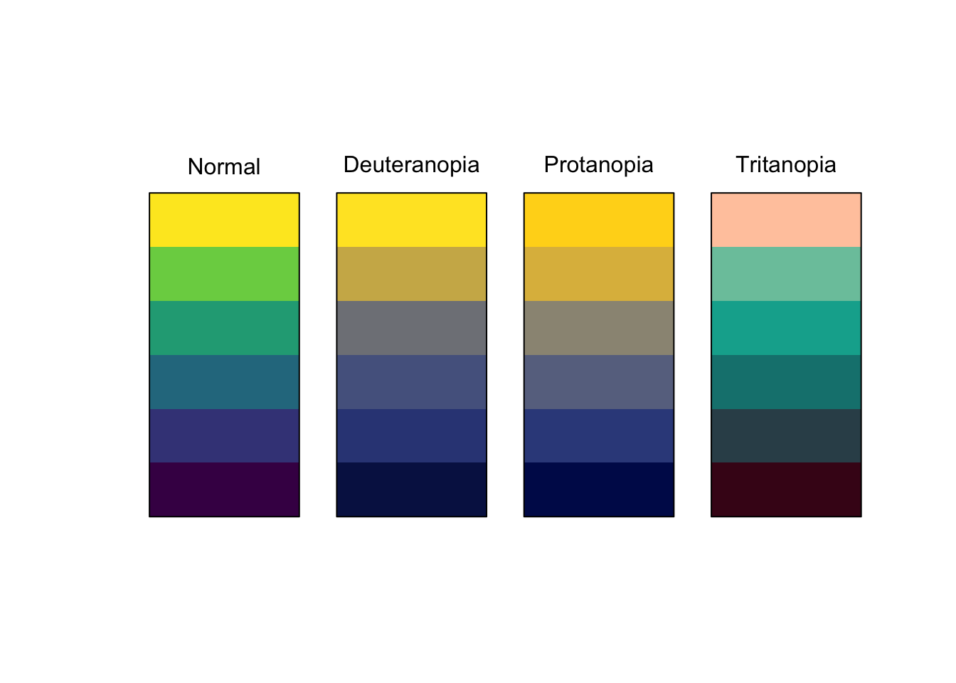
色覚多様のシミュレーションは、prismatic::check_color_blindness()で簡単におこなうことができる。
scales::viridis_pal()(6) %>% prismatic::check_color_blindness()
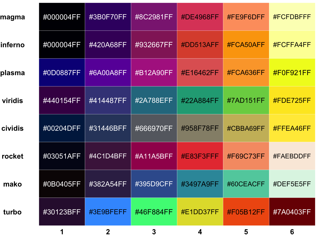
viridisパッケージに含まれる他のカラーパレットを下にしめす。
Code
tibble::tibble(
  magma = scales::viridis_pal(option = "magma")(6),
  inferno = scales::viridis_pal(option = "inferno")(6),
  plasma = scales::viridis_pal(option = "plasma")(6),
  viridis = scales::viridis_pal(option = "viridis")(6),
  cividis = scales::viridis_pal(option = "cividis")(6),
  rocket = scales::viridis_pal(option = "rocket")(6),
  mako = scales::viridis_pal(option = "mako")(6),
  turbo = scales::viridis_pal(option = "turbo")(6)
) %>%
  plot_color()
 https://gakugei.shueisha.co.jp/mori/serial/iroiro/001.html
 https://scales.r-lib.org